
KOD
Category :
Branding
Client :
KOD Real Estate
Start Date :
2024
Branding :
Voxen
01 . Project Overview
Kod Real Estate, established 15 years ago, sought a rebranding to shift its focus toward short-term rentals, aiming to compete in the digital marketplace against major players like Airbnb. This repositioning emphasized Kod’s commitment to creating a digital-first experience for renters and property owners, with a focus on convenience, quality, and seamless digital integration.
02 . Concept
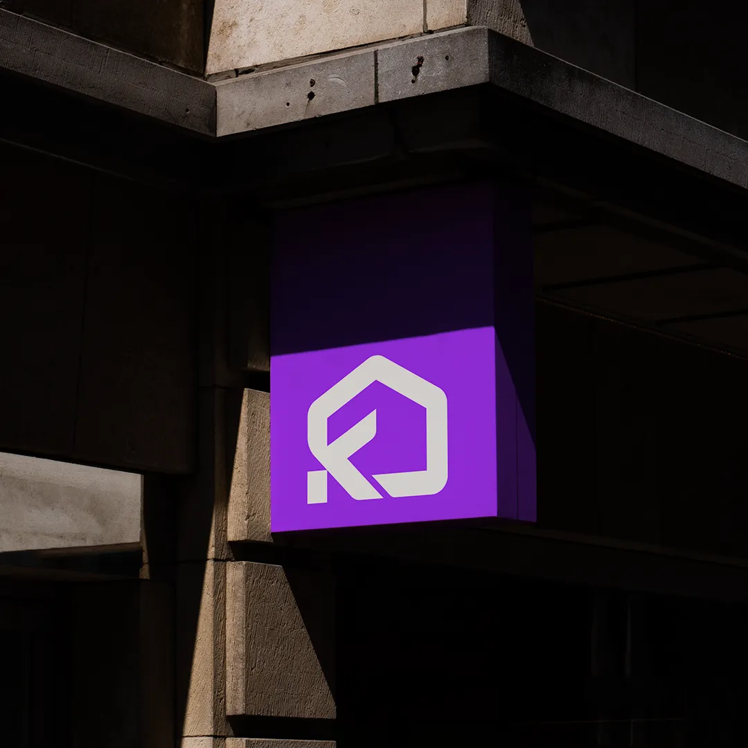
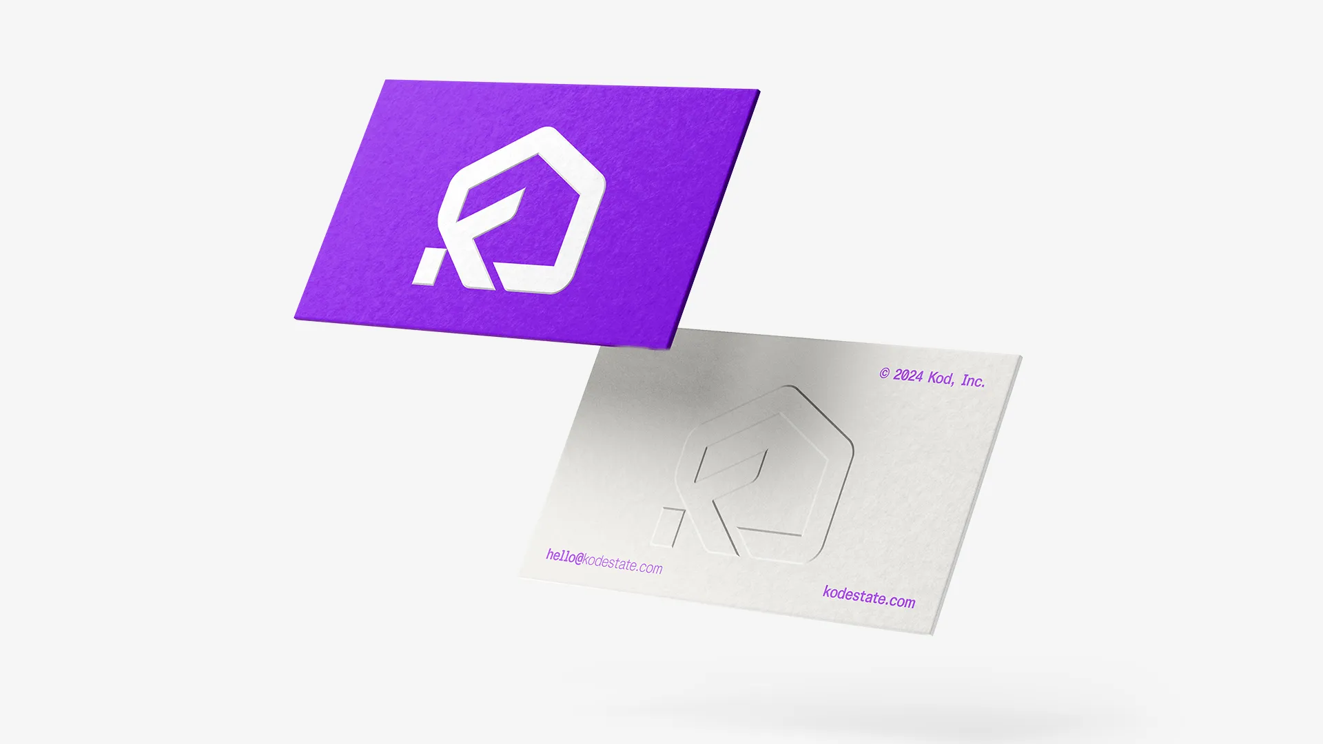
To capture the essence of short-term rentals with a digital edge, the brand colors were chosen as purple and black, evoking a modern, tech-savvy feel. The logo design subtly incorporates the initials of Kod Real Estate while also resembling the shape of a home, reinforcing the brand’s focus on rental properties. This visual approach conveys both a sense of trust and contemporary appeal, aligning Kod Real Estate with the needs of a fast-paced, digitally driven rental market.
Visual Style:
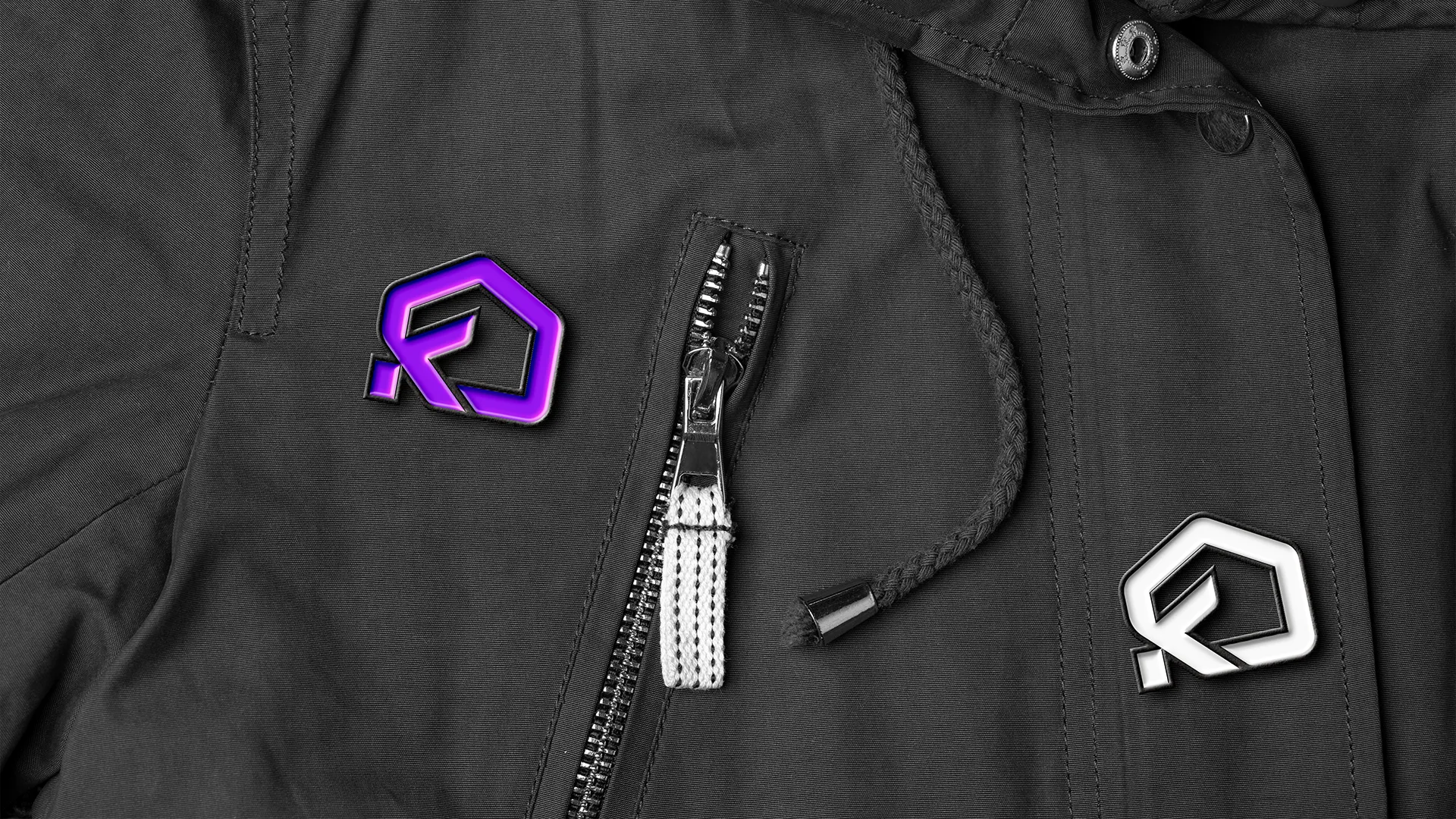
Kod Real Estate’s visual identity was crafted to be minimalistic and digitally engaging. The use of bold, deep tones of purple and black reflects a sophisticated yet accessible image, appealing to modern renters. The emblem and typography were tailored for digital adaptability, ensuring a seamless brand presence across social media, websites, and other online platforms.
Role & Contributions:
My responsibilities in this rebranding project included:
- Rebranding and Visual Identity: Developed the updated brand identity to align with Kod Real Estate’s digital transition and focus on short-term rentals.
- Motion Graphics and Video Production: Produced engaging video content and motion graphics to enhance brand storytelling and digital engagement.
- Digital Marketing: Created a digital marketing strategy to drive awareness, engagement, and bookings, positioning Kod Real Estate as a competitive alternative in the short-term rental market.